Posted on 3/16/2017 in UX and Design
By wakefly
The trends for web design are ever changing. We’ve been witness to skeuomorphic design, overused stock photos and flash splash pages. Luckily, trends are changing. Web design has become more sophisticated, not just taking into account the look, but also User Experience (UX). Within these new web design trends lay mobile-first design, SVGs, the use of web fonts and more. Below are 8 web design trends you need to consider implementing in your website now.
Mobile First
If your website is not responsive you’re already doing it wrong. Mobile and tablet devices now account for about 51% of internet use worldwide, according to statcounter.com. If your website is not mobile friendly, it’s likely that your SEO rankings are suffering. Google demotes websites in its search rankings if the website is not mobile friendly. Not only is having a mobile design important but web designers are now designing websites for mobile first, rather than starting with desktop. So it makes sense that the design of a website caters to those devices that people are using the most.
SVG (Scalable Vector Graphics)
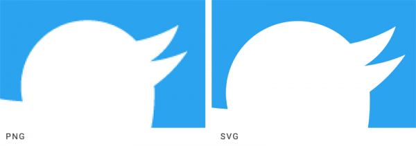
For most simple graphics or illustrations on a website, the png is being used less and replaced with SVG. SVGs are favored because the graphic will not pixelate, it will look the same at any resolution, crisp and sharp. Whereas, png, jpg, gif, or tif are raster images that can become pixelated. The difference is obvious when you see the two examples below.
Web Fonts
All too often web designers will create a design using a specific system font only to learn, after it’s too late, that the font does not render well in some web browsers. This is why many designers have taken a liking to web fonts. Web fonts are designed to display well in all browsers. Most of them are sans serif, like Roboto, which rasterize better than system fonts. You want to make your visitor enjoy their reading experience on your site. Choose a font that is web friendly and doesn’t have distractions like the ornaments on serif fonts. Lastly, most web fonts are cost-effective, if not free like Google Fonts.
Gradients
One color design trend that has made a comeback is gradients. For a while, flat design was all the rage while gradient color use was looked upon as tacky. It wasn’t until just recently that they are once again being widely used for logos, such as Instagram’s new gradient logo. Another company that has also adopted the gradient trend to incorporate into their logo is Pandora Internet Radio.
Duotone
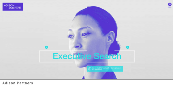
A second color trend that seems to be everywhere right now is duotone, which is famously used by Spotify. Duotone is the use of only two colors in an image. One of the two colors is used for the shadows, the other is used for the highlights and looks like the below image. Not only is Spotify using this retro color trend but other companies are using it on their banner images on their websites, like Adison Partners and Host, see below.

Static Banners
Static banners are finally starting to replace carousel sliders. I’m so happy about this. Why? Because, honestly, no one looks at all of them and they can also negatively impact your SEO ranking. In fact, only about 1% of site visitors click on a homepage carousel (2). Additionally, they can slow loading time on mobile devices, making your visitor frustrated enough to leave your site and increase your bounce rate. The new direction emerging and replacing carousel banners are static visually pleasing banners, videos and cinemagraphs. Good examples of using cinemagraphs can be seen on Ann Street Studios and how videos are used at Axiometrics.
Real and Unique Imagery
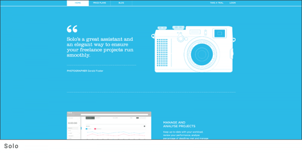
More websites are leaning toward “real” photos of real everyday people. Something else that is heading out the door is the abundant overuse of stock images. In addition, flat icons are on their way out too. Meanwhile, companies are using authentic illustrations to add a bit of personality to their websites. Below is an example of an authentic use of illustrations by Solo.
Creative Web Design
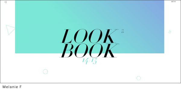
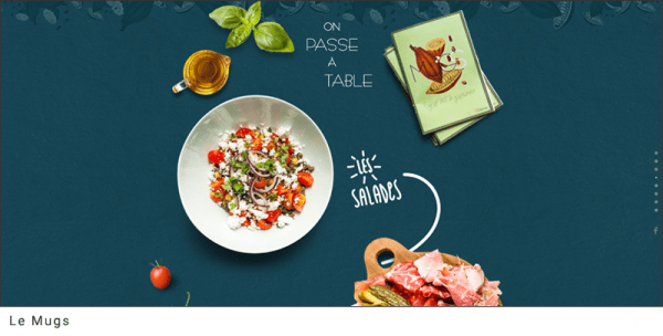
Lastly, more creative website designs trends are emerging. It seems as though companies are really trying to diversify themselves and not stick to the cookie cutter web designs everyone was so used to following. With illustrations being used within backgrounds and layered text and animations, it feels like we’re finally breaking away from a standard web design format. Some examples of out of the ordinary designs are Melanie F and Le Mugs.
As a busy web designer in 2017, I am excited to see these new web design trends emerge. They allow us to have more creative license, personality and to be able to step outside of the box allowing us to capture and keep our audience’s attention. Not an easy task in this ever-changing digital world we find ourselves in!
Considering a redesign?
Let our experienced team build you a new website that marries beautiful design and an intuitive user experience.
Related Articles

How Do I Optimize My Website for AI?
Why do you need to optimize your website for AI?AI-powered search engines like Google’s AI Overview, Perplexity, and tools such as Microsoft's [...]

Outdated or Outstanding? How to Tell If Your Website Needs a Refresh
Your website is the digital face of your business. It serves as a first impression, a marketing tool, and a resource for potential customers. [...]

Preparing a Website Redesign Budget for 2025: A Step-by-Step Guide
As we approach 2025, businesses are recognizing the necessity of a fresh, user-friendly website to stay competitive in a rapidly evolving digital [...]

