Posted on 4/14/2015 in Digital Marketing
By Dean Dorazio
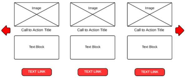
When you develop a website and utilize content types, you have to consider how you will organize the page for future management and use. One approach is to paint a page with a broad brush so that general content blocks are used to enter all the content that appears on the page. In some cases, this gives the most flexibility. The drawback is that no particular content structure is enforced and like pages can seem unrelated and disjointed. When analyzing a page, identify a structure that can be imposed and a content editor can follow. This ensures that those content types will all be organized similarly. A good example is organizing the content structure of a Call to Action block. Rather than allowing an editor to create headings, images, links wherever they like, force the organization of content. In the figure below, all of the Calls to Action are organized in the same manner with an image followed by a title, a text block, and a link.

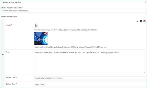
Visually this image is structured and organized but how about what a content editor sees in their content management system? In the following WordPress application, the Calls to Action Section has been organized under a single title so that each item has an image, text, button link, and button text. This approach makes it easy to be consistent. In addition, the field labels are obvious to the user and a recommended image size is denoted.

Content Types can be generic or they can be extremely content-specific. Generic ones are useful as they can be used for more than one type of content.
Analyzing Your Content Upfront
First, differentiate between a template and a content layout. You can design a two-column template but that template can be used for a variety of different document types. A two-column template can be used to display search results. One column may be used for side navigation but the main content area is broken out into elements or components of the page: title, paging mechanism, search listing. The search listing is then broken out into a linked title, URL, optional date/author, and meta description. Another example of how that two-column template can be used is for a relatively generic internal page in which the sub-navigation or calls to action appear in one column and in the main content area you have a page title and a single content block. Here are the steps to make your decisions about the layout and design:
- For each document type, make a list of the types of content on the page and determine if they warrant the creation of a content type. Is it a common and repeatable structure?
- Identify the components of those content types to be addressed and what type of content they can accept such as all text, image (with image size), and so on.
- Make sure your labels are appropriate for the content and understandable by the user.
- Determine if each of the content fields in your content type is required.
This type of planning will go a long way toward making sure your content editors know how to use your templates. If you want additional advice to create a more manageable design and user-friendly page, send us a message!
Struggling to get more visitors to your site?
Get Your Free AuditRelated Articles

Outdated or Outstanding? How to Tell If Your Website Needs a Refresh
Your website is the digital face of your business. It serves as a first impression, a marketing tool, and a resource for potential customers. [...]

Preparing a Website Redesign Budget for 2025: A Step-by-Step Guide
As we approach 2025, businesses are recognizing the necessity of a fresh, user-friendly website to stay competitive in a rapidly evolving digital [...]

Elevating Your Brand: The Transformative Power of Website Design
In the digital age, your website is often the first point of contact between your brand and potential customers. It's not just a platform to showcase [...]

