Posted on 6/11/2019 in Web Development
The planning phase of a website redesign is a critical one. There are so many things to consider to make sure that your site performs well, is user-friendly, easy to manage, and looks great. During this phase, the following items are worked out and agreed upon before moving into development:
- Sitemap, Navigation and Information Architecture
- Wireframes
- Design
- Functional Specifications

This approach generally works pretty well but there is an important component missing from the list: content. If you have content, you can certainly incorporate it into your designs but it’s not necessarily needed. You only have to know enough about your content to organize it into a site structure but this method doesn’t take into account what content is at the page level-itself.
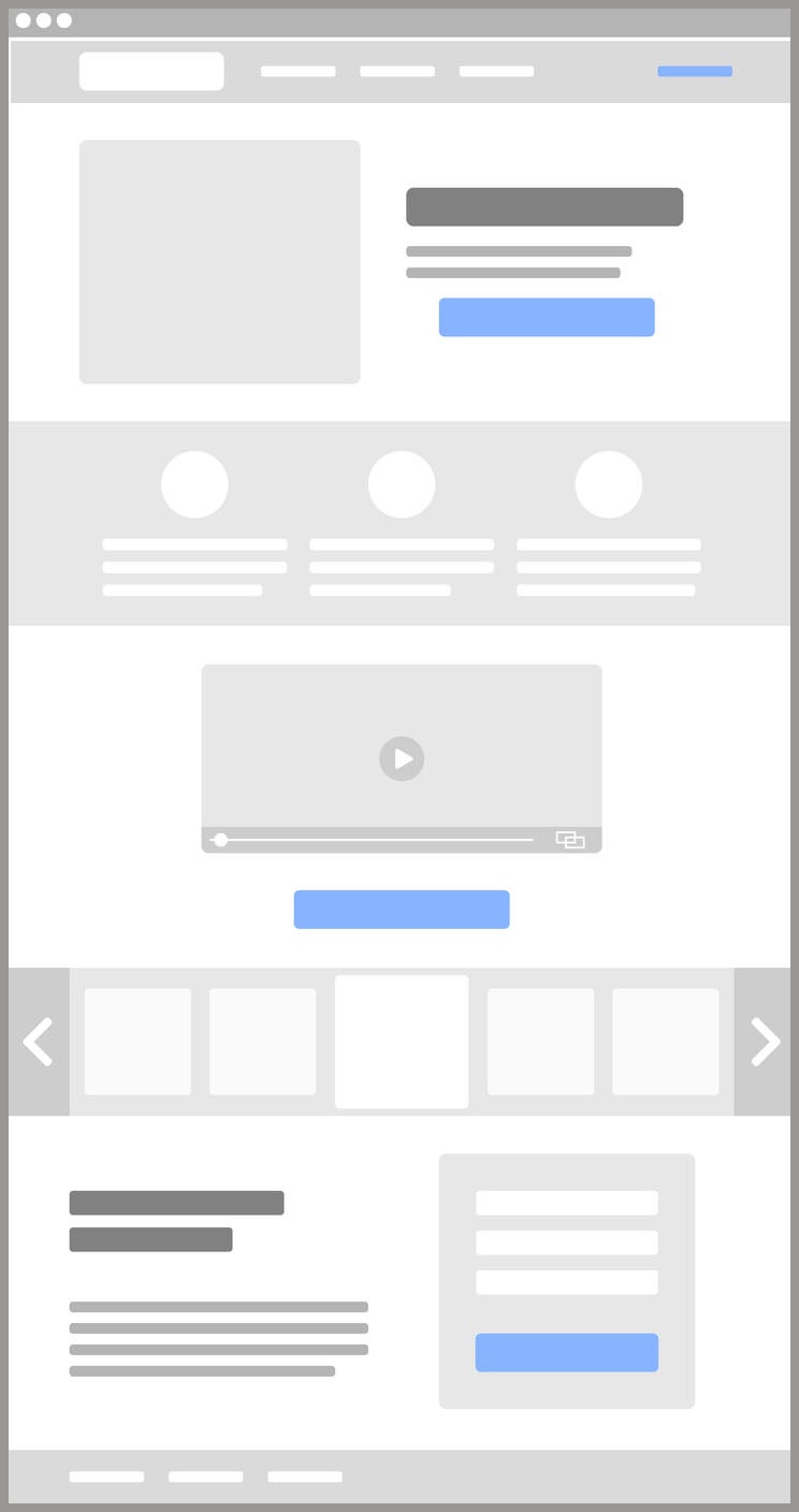
When you wireframe, you mock-up of the layout of each unique page template on the site. A wireframe outlines where content and images will be displayed. It illustrates how large the images will be and how much content is required for each section of the page. A wireframe does not show the colors, fonts, or specific content and images that will be used on the page. Those items are purposely left out so the reviewer does not get caught up in those design elements instead of focusing on the bare bones of the pages.
A benefit of creating page wireframes is that it helps you to prepare content for the site. It essentially shows a content writer all of the spots where they will need to create content for. After the wireframes are complete, the designer will lay out the page templates and then the actual content is written. Since the content creation has been the last step, the content has been written to fit the design, rather than the other way around.
An Alternative Approach

As we have been recently working towards taking a content-first approach to websites, I have been researching other methods that we can incorporate into our process. One that has really stuck out to me is the idea of using Priority Guides instead of wireframes
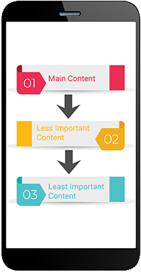
A Priority Guide includes the content and elements for a mobile screen sorted by hierarchy from top to bottom without any layout specifications. The hierarchy is determined based on how relevant content is to the user with the most critical content listed at the top.
You can create them digitally, sketch it out on paper, or by using the post-it note method. The key is that each element (or post-it) is actual content so you are really able to prioritize the bits of information that are most important or relevant to your target audience.
Priority Guides will also include annotations that provide additional clarification about functionality and page behavior, such as whether or not an item is clickable.
The Benefits of Priority Guides
This approach to website planning can help in many ways beyond just organizing your content. There are some additional benefits to using priority guides, including:
- Promoting design creativity: By simply giving the designer information about what content is most important, they can fully determine the best way to display it. Wireframes tend to provide visual boundaries that impact the layout and stifle a designer’s creativity.
- Best serving the needs of the end user: Hierarchy of content is determined by what elements are most relevant and important to the website user, and therefore, the user experience is improved.
- Providing better responsive design: By taking a mobile-first approach to content, you ensure that the most important content is front and center on a mobile screen and not lost at the bottom of a long scrolling page
- Identifying opportunities for reuse: When you inventory your content up front, it helps you visually see where you might want to reuse content. Knowing this during planning means the developer can build the site in a way where it can be managed in one place but displayed in many.
There is certainly still a place for wireframes within the website process but if you want to take a content-first approach to design, priority guides are a valuable tool that will help you keep your site focused on your end-user.
Looking for help on how you can make your website more customer focused?
Reach out to us today to find out how we can help
Related Articles

Outdated or Outstanding? How to Tell If Your Website Needs a Refresh
Your website is the digital face of your business. It serves as a first impression, a marketing tool, and a resource for potential customers. [...]

Preparing a Website Redesign Budget for 2025: A Step-by-Step Guide
As we approach 2025, businesses are recognizing the necessity of a fresh, user-friendly website to stay competitive in a rapidly evolving digital [...]

Demystifying SPF, DKIM and DMARC: Strengthening Email Security
With Slack and other instant messaging services handling more and more of our online communication, email can sometimes feel like a newspaper being [...]
