Posted on 8/18/2020 in UX and Design
By Kynan Pacheco
Did you know that on average users spend 5.95 seconds looking at a website’s main image and 5.59 seconds looking at a website’s content? That means on average a total of 11.51 seconds on the page but visitors form an opinion on the site within 50 milliseconds! In short, we don’t have much patience when it comes to bad user experience so you need a solid approach to make sure you get the right information in front of the right visitor.
So what is information architecture and why is it important for web design and good user experience? In simple terms, information architecture is how your content is structured and delivered to the user, all while keeping in mind that overall design is also a major contributing factor. It is used when deciding how to arrange the infrastructure, features, and hierarchy in such a manner that your visitor can navigate easily and find what they are looking for.
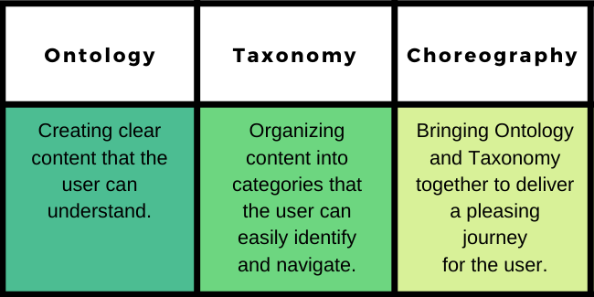
Keeping information architecture in mind can prevent costly redesigns and boost website traffic by keeping the focus on user-friendliness. Information architecture can be boiled down into three categories: Ontology, Taxonomy, and Choreography. These are generally referred to as the gears of information architecture. Each needs corresponding movement from the other to function and the success of your information architecture depends on the interplay between the three.

Ontology
Ontology is attempting to understand how users will consume your content. The user's background can change how a particular bit of content is interpreted, for example, an article about a water fountain might mean something very different based on where you are from (Bubbler, Drinking Fountain, or Decorative Sculpture). This extends beyond words as well, do the symbols on buttons and links convey a clear sense of purpose? Taking time to understand the different ways users view different words, symbols, and colors to eliminate any ambiguity will improve the user experience immensely.
Taxonomy
Taxonomy is the art of organizing and arranging content into clear categories both for content on the page and creating a navigation that is easy to follow. Creating a taxonomy through mind mapping will allow for a blueprint on how to logically layout content. Start with a one-word or short phrase about your site and branch off from there. Doing this will give you a good idea of the relationships within your content. Alternatively, you could use other methods such as Hierarchy Maps, Affinity Maps or Card Sorting.
Choreography
Choreography is the term used for the combining of Ontology and Taxonomy into the actual presentation for users. It is the interaction among its parts. At this stage in your planning, you should be asking yourself the following questions:
- How much content is on the page and can it be easily understood at a glance?
- Is there a clear method of drilling down through content?
- Does the path I am leading them on align with my business goals and the goals of the user?
It’s important to consider the content from the user’s perspective and use that information to create a layout they can easily digest. This will keep the visitor engaged and potentially drive them deeper into your site and keep them coming back. The goal is to have repeat visitors to your website.
In closing, remember that constantly putting yourself in the mindset of the visitor is the key to creating a website that users will love. Remind yourself that information architecture is to a website, library, or shop, what the concrete foundations are to a house. This can all seem a bit abstract but keeping this in mind when designing a website and doing content entry, your website will lead to cleaner website design and more traffic.
Struggling to get more visitors to your site?
Request a Free SEO Audit of Your Website!Related Articles

Outdated or Outstanding? How to Tell If Your Website Needs a Refresh
Your website is the digital face of your business. It serves as a first impression, a marketing tool, and a resource for potential customers. [...]

Preparing a Website Redesign Budget for 2025: A Step-by-Step Guide
As we approach 2025, businesses are recognizing the necessity of a fresh, user-friendly website to stay competitive in a rapidly evolving digital [...]

Elevating Your Brand: The Transformative Power of Website Design
In the digital age, your website is often the first point of contact between your brand and potential customers. It's not just a platform to showcase [...]

