Posted on 3/17/2015 in Digital Marketing
Did you know that less than 10% of website users are interacting with homepage carousel features?
Rotating banners are used on many sites – but popularity doesn’t necessarily equal effectiveness. Use of this prime piece of real estate needs to be carefully considered. It’s best suited for content like:
- your company’s value proposition
- promotion of your most important product or service
- a specific call to action that will entice your user to click
The mistake that so many people make is to try to include too much information on their homepage so they use a carousel to keep it from looking cluttered. However, when you have multiple banner slides cycling through on a homepage carousel, the bulk of your content is ignored or not even seen. Additionally, there are usability, accessibility and conversion issues.
So why do so many people use them?
There seem to be 2 main reasons why everyone uses them.
1) They’re trendy. Visually, they can be very appealing. While lots of nice imagery and animation effects look cool, online marketing is about substance over style.
2) They prevent you from having to make a decision about what content is the most important. A carousel can be a crutch. Businesses will include too much content instead of narrowing it down to a single most important message.
Problems with a home page carousel
Poor Click through rates
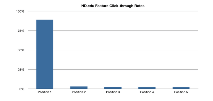
A study done at the University of Notre Dame in 2013 showed that less than 10% of visitors to the sites they reviewed clicked a feature in home page carousel. Of those visitors, approximately 80% clicked the first slide and then interaction with the later slides drops off significantly.

When content is buried on the third or fourth slide, most of your audience will never see it. This is a missed opportunity to engage with your audience. Content can also be missed because the auto-rotation speed is set too quickly and it shifts to another slide before you have time to finish reading. Even with manually-controlled carousels, unless the user already knows what content is coming on the future slides, they don’t have a lot of incentive to click.
Accessibility Issues
In addition to the issues mentioned above, people with disabilities encounter problems when trying to access content via screen readers or keyboard access. According to Accessibility expert and WebAIM associate director Jared Smith, auto-playing carousels will just cause content to disappear or sometimes force the user back to the top of the page. Carousel controls can’t be easily programmed to associate with the carousel content, which is especially challenging for the visually-impaired.
Performance
Having multiple image-rich banners on your home page can decrease your site’s speed. When a user hits the home page, it will need to load the images in all of the banners. The image file size is often a contributing factor to slow page load speeds. A Kissmetrics study shows that 40% of people abandon a website that takes more than 3 seconds to load. By having a single static banner, you can clarify your message while improving your site performance.
Better Approaches to your Homepage Banner Area
The most important things your homepage should do are communicate a clear message and allow users to find the information they are looking for. By simplifying your banner area to a single static background image with a clear message and call to action, it eliminates the clutter and distraction and allows your users to understand your content better. Create a hierarchy of content on your page. Use the top banner to promote the most important information and entice the user to interact with actionable links. Beneath the banner area, include 3-5 other highlights such as recent blog posts, information about the company, a recent case study highlights or a featured product. All of the content on the homepage should be designed to draw the user deeper into the site.
A question that Wakefly always asks during our creative strategy meetings is: “What are the most common questions that customers/prospects ask?” Chances are – these are the same items that people are searching for when they arrive on your site. Make sure that when they get there, they can find what they are looking for. Don’t lose a potential conversion because you buried great content on the fourth rotation of your sliding banner.
Want to learn more?
Reach out and connect with one of our inhouse experts!Related Articles

Outdated or Outstanding? How to Tell If Your Website Needs a Refresh
Your website is the digital face of your business. It serves as a first impression, a marketing tool, and a resource for potential customers. [...]

Preparing a Website Redesign Budget for 2025: A Step-by-Step Guide
As we approach 2025, businesses are recognizing the necessity of a fresh, user-friendly website to stay competitive in a rapidly evolving digital [...]

Elevating Your Brand: The Transformative Power of Website Design
In the digital age, your website is often the first point of contact between your brand and potential customers. It's not just a platform to showcase [...]
