Bay State Savings Bank
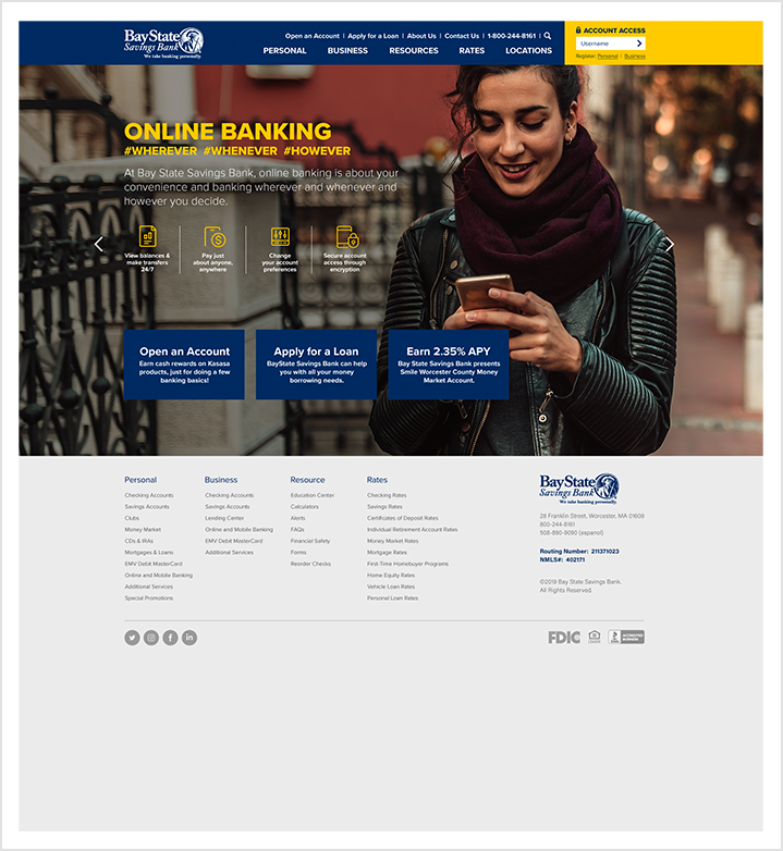
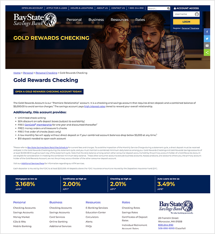
Web RedesignWakefly redesigned Bay State Savings Bank's website to improve its user experience, speed up load time, and refresh its appearance.
Project Overview
Bay State Savings Bank came to Wakefly for help redesigning their website. It was outdated and needed a complete refresh. The main goals of the project were to:
- Provide a clean, professional design that supports their brand.
- Encourage visitors to contact them via calls to action.
- Clearly explain Bay State's offerings and value proposition to their target audience.
- Employ a content management system (CMS) to ensure content is fresh and structured.
- Create a navigational flow for each target audience so that they can easily find relevant information.
In addition to redesigning and reorganizing the website's content, we also focused on web accessibility throughout the project. Knowing that banking is a heavily regulated industry, we worked with the client on adjustments to color contrast to avoid ADA compliance violations.
Since launching the new site in the fall of 2019, it has generated a lot of positive feedback from customers, employees, board members, and senior management. The marketing group at Bay State Savings Bank has stated that the new design of the website has definitely played a role in helping them to better satisfy their customers.
Key Features
- Improved rate management
- Scheduled alert banners
- Web accessibility
- Flexible component-based page templates

