Fremont Bank
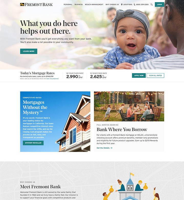
Web RedesignFounded in 1964, Fremont Bank is a family-owned bank with a family-owned feel. Driven by their deep commitment to their clients and the surrounding community, they redesigned their website to provide a more intuitive experience that will help them achieve their goals.
Project Overview
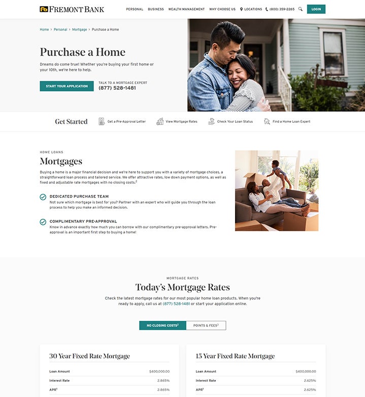
Fremont Bank partnered with Wakefly to develop their new corporate website. They were already working with another agency to handle design, content and SEO but needed an implementation partner with deep Kentico experience to help them carry out their vision. This redesign was a major initiative for the Fremont Bank team. It included a complete overhaul of their content and restructuring of the site to provide an improved user experience that allows users to find content in a more intuitive way.
The approved site designs were built with accessibility in mind, using the latest front-end technologies. The new site was developed on Kentico 12 MVC and uses a combination of component-based templates and page builder templates to provide them with maximum flexibility. Dozens of custom page types and widgets were built to give them total control over the layout and styling of their pages.
Key Features
- flexible widget-based templates
- fuzzy search
- interactive locations map
- leaving site notice
- custom alert banner
- dynamic rates
- FAQs
- custom forms

