Preferred Mutual
Web RedesignPreferred Mutual Insurance Company provides property and casualty insurance coverage to more than 232,000 individual and business customers through a network of more than 500 independent agents.
Project Overview
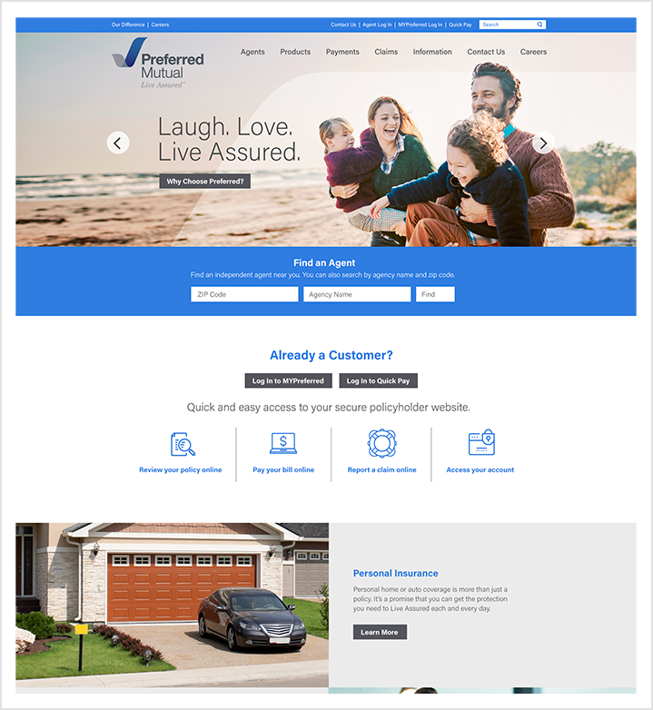
Preferred Mutual came to Wakefly with a list of pain points about their current website. They didn't want to undertake a full redesign at this point, but they were not happy with the user experience and they also were struggling with the back-end management of the content. We worked with them on three key user enhancement initiatives:
- Homepage redesign: Create an area for important announcements that they could easily edit
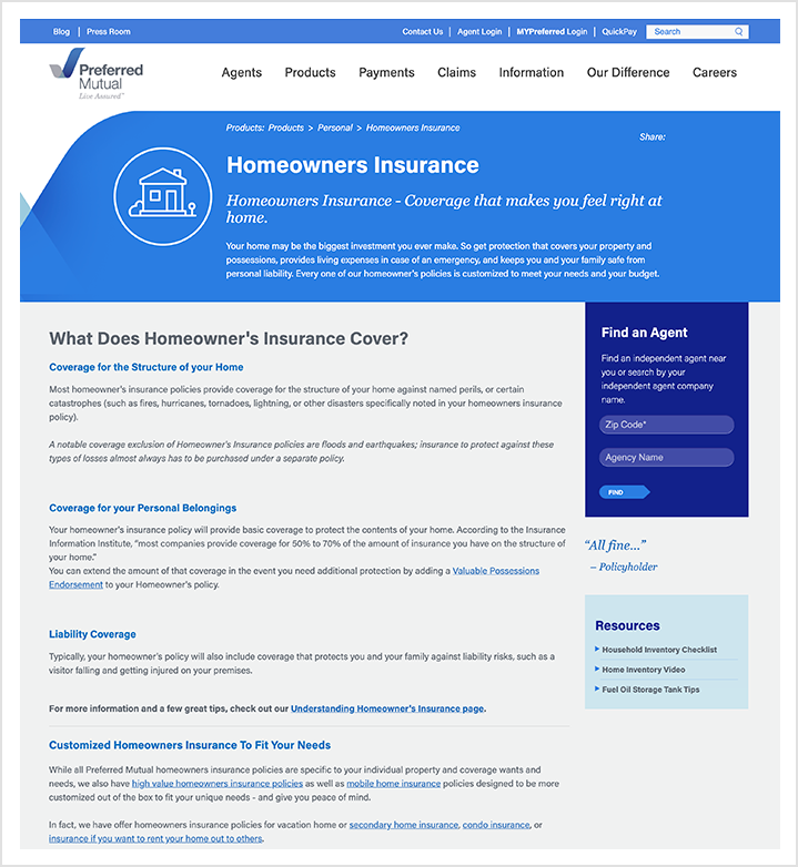
- Improve template responsiveness: Minimize "dead space" on the page and adjust interior page layouts to make better use of the space.
- Redesign navigation and menu behavior: Resolve issue with navigation pushing content too far down the page causing unnecessary scrolling before the user got to useful information.
In addition to these UX improvements, Preferred Mutual was also on an outdated version of Sitefinity. We upgraded their site to the latest version so that they could take advantage of the latest features available within the Sitefinity platform.
Key Features
- Sitefinity upgrade
- UX improvements
- Responsive design

